Creative Brand Strategy: Task 3
15.05.2023 - 19.06.2023 (Week 7 - Week 12)
Adeline Wong Chyn Nee / 0344017 / Tai Li Lian
Creative Brand Strategy
Task 3 / Campaign Branding (Final Compilation)
INSTRUCTIONS
Task 3 / Campaign Branding (Final
Compilation)
Week 07 - Week 12
We were tasked to continue building the brand behind our
campaign by designing the touchpoints and bringing them to
life with mockups. Then, combine them together with the
previous two tasks in a slides and bring those concepts
into a complete visualised campaign!
Brand Identity
Logo
For my campaign logo, I started by creating a graphical element based on my brand primary colour palette, however changed the initial idea into something more sketch-like for the character, and a simpler bold typeface for the wordmark that fits the brand identity best.
Logo
For my campaign logo, I started by creating a graphical element based on my brand primary colour palette, however changed the initial idea into something more sketch-like for the character, and a simpler bold typeface for the wordmark that fits the brand identity best.
Graphical Elements (Characters)
For my campaign graphic elements, i've decided to utilise it to amplify the fun personality of 'Eat A Bit Of Everything'. Four characters with different shapes and personalities are made and they will be applied to most applications of the campaign.
For my campaign graphic elements, i've decided to utilise it to amplify the fun personality of 'Eat A Bit Of Everything'. Four characters with different shapes and personalities are made and they will be applied to most applications of the campaign.
Touchpoints
Social Media
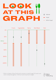
For my campaign social media, I first focused on the infographic post since the original infographic got finalised very early on in the project, since it has to be easily understood at first read, lots of time and focus went into that post. For the rest, I followed the eclectic style I proposed and maintained that for all the posts, it is evident in the promotion posts,
For my campaign social media, I first focused on the infographic post since the original infographic got finalised very early on in the project, since it has to be easily understood at first read, lots of time and focus went into that post. For the rest, I followed the eclectic style I proposed and maintained that for all the posts, it is evident in the promotion posts,
Website
For my campaign website, I first focused on the landing page as it is the most important of all pages. There are six pages in total, first one being the landing page, then I added About Us page, Promotion page, Product page, Add To Cart page, and Contact page.
Promotional Video
For my campaign promotional video, I started by gathering the clips from pexels.com and planned out the flow of the video in the timeline of Premiere Pro by cutting and stacking. The narrative of the video follows a little girl who is refusing the eat her vegetables and the "narrator" of the video (which we can not see physically) negotiates with the girl by offering her promotion for her fruits and vegetables and that it would make her mom happy, only if she eats her vegetables. She then ends up eating and liking what she just ate.
For my campaign promotional video, I started by gathering the clips from pexels.com and planned out the flow of the video in the timeline of Premiere Pro by cutting and stacking. The narrative of the video follows a little girl who is refusing the eat her vegetables and the "narrator" of the video (which we can not see physically) negotiates with the girl by offering her promotion for her fruits and vegetables and that it would make her mom happy, only if she eats her vegetables. She then ends up eating and liking what she just ate.
Final Presentation Slides
FEEDBACK
Task 3:
Week 7
Specific feedback
Looking at the first draft of my logo, Ms. Lilian raised two concerns. First being the colours used, which are the two primary colours of my campaign. When applied onto my touchpoint designs, they would blend in with the rest if both uses the primary colour, so nothing stand out. Second being the art style. I initially proposed a children drawing-like logo, and the references are sketch-like and fun. However, the one I showed her appears to be more details than expected. So I was advised to tune down the details and stick to the original style, while still keeping the idea of using an angry vegetable.
As for my infographics, Ms. Lilian said that they are easy to understand and shows my brand identity too. However when translated into a social media post, it is quite limited which means I have to make them understand with the graphics I have on hand.
Week 8
Specific feedback
The first typeface (Adam Warren Pro) looks good alone as it has a nice contrast, however when Ms. Lilian and i tested it onto one of my touchpoints, it seems rather unfitting with the identity. On the other hand, Ms. Lilian agrees that the one using futura bold seem to fit my brand identity the best, so I went with that. With that, Ms. Lilian prefers the potato character better for the logo. Among the logo variations i made, Ms. Lilian felt that the the ones using futura bold has the most decent arrangement of both character and wordmark. However, I was encouraged to play around on the spot with and i came down with a new arrangement after discussing with Ms. Lilian. Both myself and Ms. Lilian felt that when we moved the wordmark downwards, it wouldn't take up as much horizontal space At the same time, it would still be able to show that the campaign name is being shouted by the potato just nicely. It also acts as a nice balance between character and wordmark.
For my infographic social media post, I was advised by Ms. Lilian to add more information about the infographic to help viewers understand better. The graphical elements itself could be tweak around or flipped to see what first best. Not just that, i was advised to include one of my campaign characters into this post to emphasise their presence for the campaign, it also reminds consumers that these little campaign characters exist as a fun element. I was told that my body text would be difficult to read from a phone so I have to increase the body text size.
For my infographic social media post, I was advised by Ms. Lilian to add more information about the infographic to help viewers understand better. The graphical elements itself could be tweak around or flipped to see what first best. Not just that, i was advised to include one of my campaign characters into this post to emphasise their presence for the campaign, it also reminds consumers that these little campaign characters exist as a fun element. I was told that my body text would be difficult to read from a phone so I have to increase the body text size.
I was advised by Ms. Lilian to decrease the type size for my navigation bar pages. At this stage, I would need to develop more to see what it would look like. I was advised to bring back the carrot character I did as one of my logo character options, so I integrated that in my final landing page design.
Week 9
Specific feedback
For one of my promotion social media post, I was advised by Ms. Lilian to use Whinee as the mascot since I hasn't used her as a main character in a post, however looking at the overall design itself, Ms. Lilian did feel it could definitely be better. For my character post, Ms. Lilian advised me to make a simple cover that leads to the characters using the same grid style as the first. In the end, Ms. Lilian thought it was still better to have a more plain cover that doesn't reveal the characters, then separate each of the characters into single posts. That is so they get more spotlight and it also gives each of them more space overall.
For my website 'About Us' page, I was advised to add an extra section for my infographic to allow users to click into it and get to know more about the campaign and why they should eat healthier. With that, I can include the only character that I haven't include, which is Whinee. Not just that, i was reminded the importance of my imageries as i have yet to show my main image to display for this page during feedback, she advised that I photoshop the characters so it looks like they are shopping in Village Grocer.
Week 10
Specific feedback
For one of my promotional social media post, I showed Ms. Lilian two options, one more normal yet still ecstatic, and the second one, with the campaign character Yelle, looking at the cut-out piece of tomato that signifies the 23% promotion offered. Ms. Lilian immediately picked the second one and said it's because that would suit the campaign much better than the first one, it stays true to the brand personality! For my character post, I showed Ms. Lilian two options, one more normal yet still ecstatic, and the second one, with the campaign character Yelle, looking at the cut-out piece of tomato that signifies the 23% promotion offered. Ms. Lilian immediately picked the second one and said it's because that would suit the campaign much better than the first one, it stays true to the brand personality! For my Did You Know post, Ms. Lilian commented that my body text would be difficult to read if the size is reduced to the resolution of a phone, so I was advised to increase the type size. Not just that, in the initial draft, I had a black outline for the green box but was advised to remove that outline as it doesn't align with my current brand identity and it isn't used on any other designs, so I removed it.
Week 11
Specific feedback
Given that I showed the 23% offer promotional post design for two weeks straight and didn't get a satisfactory feedback, I didn't to complete change it. Ms. Lilian did say that the point of the post, is to promote the 23% so that should be emphasised more.
The promotional video is looking good, I was told to proceed and to show more next week.
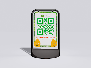
For my guidance sign merchandise, I was advised to add reminder of the brand onto the design.
Week 12
Specific feedback
On my website, I was told by Ms. Lilian to change the dollar sign into 'RM' as it is a Malaysia campaign so to not confuse the users, I updated it.
REFLECTION
This module has honestly been a journey of self-critique and personal growth. It wasn't always easy, but the rewards were worth it. Creating mockups of my finished designs was a highlight of the process as it is always satisfying to see the ideas come to life. I'm so glad that I had the opportunity to work on a campaign that aligned with my values and suited my personality. It made a significant difference and fueled my passion for the project. Having that authentic connection to the work I was creating was incredibly satisfying. Throughout this task, there were challenges. Engaging in self-critique meant questioning my decisions and exploring alternative possibilities. It pushed me out of my comfort zone, but it was a valuable learning experience. It helped me refine my skills and develop a discerning eye for effective branding strategies. Overall, this branding class has been a fruitful experience and I'm grateful for the knowledge gained and the growth I've achieved throughout this journey.
FURTHER READING
will update in a while... got to sleep (sorryTT)


Comments
Post a Comment