Illustration & Visual Narrative: Task 3 and Final Project
NAME: Adeline Wong Chyn Nee (0344017)
I.D: 0344017
COURSE: Bachelors of Design in Creative Media
MODULE: Illustration & Visual Narrative
____________________________________________________________________________
LECTURE
Week 8: How To Make Comic
To dive into our final project, we were taught the way how to start one! Creating a comic is something I have been wanting to do since getting into design and now that I am learning about it is the first step towards my final outcome!
-
Well, to create one, we would of course have to think of an idea, not just an idea but one that is from our own experience, one that we can relate to on a certain level. Ideas from our heads are just fresher and more interesting than the ones we find on Google, so we were also advised to avoid browsing the web for our ideas.
HOW TO COME UP WITH IDEAS?
- Brainstorm
- Mindmapping
- Concept
Whatever we do, we would have to start by brainstorming our ideas in order to create something meaningful and elaborate enough that the readers would understand what we are trying to tell!
Fig. 1.1 Mindmapping
So first, set on one most important topic of our project that we'll be designing, then from there, we can think of the 4 wives 1 husband rule. (What, Who, When, Where, How?)
Fig. 1.2 4 wives 1 husband
After developing the main topic and ideas, we would have to figure out an aim or goal, a concept that drives us, artists. Through this
-
To do well in this next project, Ms. Anis introduced these 5 practice to build a mental library.
So far, I have done a few of these like watching movies and listening to ADHD music. (ambient music)
Fig. 1.3 practices to build mental library
Apparently, the more we stress having the best ideas, the more it won't come to us and to be honest it is pretty true because now that I think about it, I usually think of ideas during the most unexpected situations.
It could even be a casual conversation with someone we know or just met, even that could spark some ideas in our heads and allow us to create something really interesting.
EXECUTION
Last but not least, we would have to note down the simple keywords/ ideas in point form wherever we go. As ideas could pop up in our heads anywhere we are, we should note them down as soon as we think of a good one to make sure we don't forget about it!
____________________________________________________________________________
INSTRUCTION:
____________________________________________________________________________
ASSIGNMENT BRIEF (Final Project)
Decisive Moment! (Animated poster design)
____________________________________________________________________________
Idea development
Story plot (3 acts structure)
To start with any of my idea development, I first plan out the ideas in my head from things such as concept and the overall look of the comic. The first thing that came to my mind when I think of horror is my sleep paralysis. To define it, sleep paralysis is basically when you cannot move or speak as you are waking up or falling asleep. It can be scary but it's harmless and most people will only get it once or twice in their life. As for me, I often experience them when I'm having naps, just as I fall into the state of sleep, the "horror" starts. Usually, it is experienced like a normal sleep where I can't move or speak, however, on some occasions, I see my surroundings, my bed, my desk, my window, however it is not real and just a dream. Following that, shadows figures or furry creatures would appear gliding across my room, staring at me or sometimes, even sitting on top of my chest, looking down on me while I suffocate.
Story plot in 300 words
1- Setup
After studying for 8 hours straight and looking drained, Rue checks her phone and realized it is already way passes her bedtime at 1:44 AM, she then notices a text notification from her boyfriend, Owen saying "drink lots of water Rue" and "are u okay??". Rue picks up the phone to reply however she hears the sound of keys unlocking on the front door and quickly shuts her laptop and rushed to her bed, pretending to have fallen asleep to avoid her drunken and abusive father who just come back from a seance Rue told him not to go, he thought that perhaps if he went, he would have a slight chance of contacting his late wife... It has been 3 months since Rue's mother passed and things are not like how it was before.
2- Rising action
Feeling restless and uneasy, Rue stares into her bedroom ceiling with teary eyes while the sound of her father from outside slowly fades out into a ringing sound and Rue's eyes shut into blackness. When she opens the lids of her eyes, her surroundings are painted red and she struggles to move as she panics and her eyes wander around the room then focus on a blurry shadow under her table as it slowly ascent from the cold floor and its eyes staring right into Rue's, blinking coldly at her.
3- Conflict and resolution
With her eyes still wide open, the shadow looks up onto the ceiling and there hangs a Gorilla man with bulging eyes and straight yellow teeth, Rue turns away slowly to avoid eye contact with the creature. After thinking to herself, Rue came to the realization that she is having sleep paralysis and tried to move her fingers to wake herself like she usually does.
She lifts a finger after another, and finally released herself from the paralysis with a deep gasp. Her surroundings return back to normal and she sits up to calm and reassure herself that it was just a dream. As she reaches for her phone to reply to Owen's text messages, the Gorilla man remains at the corner of Rue's ceiling staring at her, smiling...and stalking her...
____________________________________________________________________________
VISUAL RESEARCH
FINAL PROJECT: Webtoon & Motion Comic
To start with this project, I head to Pinterest to find visuals for developing my existing ideas. I first came across this image of an artwork and immediately sparked something important for my comic.
Fig. 3.1 Artwork that sparked the idea
This artwork uses a technique/ style of design which consists of just two colors — one for the dark parts of the image and one for the light ones. It is a striking style choice and would complement the comic's negatives and positive points, making a clear difference between the 2 when reading through even at a fast pace. Since there's not a lot of colors to look at, the viewer would be able to tell the meaning of a panel quicker.
Red & Black (duotone comic)
As for my comic, the comic theme, horror just screams red to me, just the tone of red is a sign of danger and is frequently used in our daily lives such as the red traffic light, caution sign, or the color of blood itself. It acts as warning signs to inform us of upcoming ominous events. While reading my comic, I hope that the readers would immediately understand the progression of my comic just by looking at the color change.
Fig. 3.2 Red & Black toned reference
What is a horror comic without its shocking aspects, right? Although it is a one-shot comic, I thought of putting together 2 shocking parts of horror with one after the other. Just when the reader prepares to put their guards down, I surprise them with a second one.
These are my ideas for the first and second ghosts respectively.
Fig. 3.3 character reference #1
Fig. 3.4 character reference #2
When my eyes first met with this bootylicious Gorrila man on Pinterest, I knew at that moment that I had to include it in my comic, as the final surprise.
-
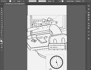
Comic Panel Sketch
(click to enlarge)
I started my sketching process in Photoshop by following my previous planned out panel work. As I draw, I realize I did not follow 100% of my plan and made slight changes to my sketches from what I thought would suit the flow of my comic best. I decided to sketch with the pages combined to not restrict any panel movement, so I drew continuously and finally achieved 73 panels (text box included) in total.
-
Digitalization of Sketches
Fig. 5.1 Digitalization #1
Fig. 5.2 Digitalization #2
Next, I went to Illustrator to digitalize my sketches with the trusty duo, pen tool, and direct selection tool. I constructed the outlines of the main elements of each panel to be at least 6 pt thick. Since my panel sizes are large and take up most of the space of a single page, I figured that was one way to make big elements like the hands look prominent.
-
Onomatopoeia in Comic
In my comic, I constantly utilize Onomatopoeia to create aural effects that mimic the visual or thing being described.
Fig. 6.1 Onomatopoeia #1,2
For example, there is a scene where the protagonist's dad comes back home from a seance and in order for the protagonist to be aware of what's happening, 'rattle rattle' appears when the dad unlocks the door lock, signifying that the rattling keys on the door were loud enough for the protagonist to have a reaction for it.
Not only that, but Onomatopoeia like ruffling noises, gasps, sighs, and ding ding is used to mimic the visual of the comic.
Fig. 6.2 Onomatopoeia #3,4
Fig. 6.3 Onomatopoeia #5,6
-
Coloring in Comic (Digitalization)
I created a color palette for my comic to fix on in order to ensure consistency throughout the whole thing. Different outline colors are chosen for different sections of the story (setup, rising action, and conflict).
When the story switches up, the color ultimately changes to match the build of the comic. For example, the colors below are the main outline and fill colors of the comic before and after the climax.
Fig. 7.2 Outline color plan
-
Creating the textures
It has finally come to the conflict part of the comic where we meet our bootylicious Gorilla man. In the sketch, I drew fur-like strokes on the character, with the plan to create a furry Gorilla like the one in my reference image. When creating in Illustrator, I discovered another way of creating fur-like texture using the 'Roughen' effect' in the effects panel instead of just drawing the fur textures out one by one.
This is where I found it after testing each Illustrator effect.
(Effect > Distort & Transform > Roughen)
This is what I applied to the Gorilla man to achieve his fur-like textures.
Fig. 8.2 'Roughen'
This is the results after using the effect 'Roughen'
Fig. 8.3 'Roughen' result #1, 2
Fig. 8.4 'Roughen' result #3
Here's a close-up look at the applied texture.
Fig. 8.5 'Roughen' result close up #1, 2
-
Width Profile of Strokes
During my process of discovering more tools in Illustrator, I came across 'width profile' it is a simple tool that helps determine the shape of your strokes. It is such a simple tool but the difference it made is so crucial in achieving a look of natural flow.
Without it, my strokes would look tacky and restricted, it also would not allow a smooth animation later on in the further development process.
Fig. 9.1 With & without width profile tool
Fig. 9.2 With & without width profile tool
-
Motion Comic Animation
Before officially starting with the animation, I followed the tutorial video made by Ms. Jennifer on how to prepare our Illustrator layers on a 1920 x 1080 composition. We were taught to divide the layers into groups of elements we want to animate and not animate. After this process, I achieved a total of 257 layers in total.
The empty artboard (green lines are indications for video format)
Fig. 10.1 Illustrator video canvas
Layers of some panels
Fig. 10.2 Layers separation
Fig. 10.3 Layers separation
After organizing and saving my Illustrator file, I imported it into After Effects for animation. The first thing I did was create all of the compositions I needed to use, which is 49 compositions in total, that is the total number of panels I had to animate for my comic, I excluded the layers that are adjustable in Premiere Pro and only imported the ones which require complicated animating.
To start with this process, I went through 2 steps to prepare.
1) Importing the Illustrator files into After Effects
2) Creating new compositions for each panel
Fig. 10.5 Create compositions
Easy Ease
For my animation, I frequently use easy ease (f9 for mac) to create smoother and life-like motions.
Fig. 10.6 Easy Ease Timeline #1
Fig. 10.7 Easy Ease Timeline #1
Fig. 10.8 Easy Ease Timeline #1
Puppet Pin Tool
I watched a tutorial on youtube on how to use the Puppet Pin tool and incorporated the tool for some elements which turned out better than expected. The Puppet Pin tool is a tool where you place and move Deform pins. Puppet Overlap tool. We can also use this tool to place Overlap pins, which indicate which parts of an image should appear in front of others when distortion causes parts of the image to overlap one another.
After watching the video, I acquired a new skill to put into my motion comic.
Fig. 11.1 Pupper Pin Tutorial
These are some screenshots of my After Effect that show me using the puppet tool. When pinning the layers a yellow point will indicate on the screen and we would have to move it where we want it while still keeping in mind the anchor points. After a while of using this tool, I understood the reason for using it and incorporate more detailed elements of my panel such as the hand and the finger.
Fig. 11.2 Pupper Pin Tool
Fig. 11.3 Pupper Pin Tool
-
Final Outcome
Youtube link to Motion Animation
____________________________________________________________________________
Reflection
This final project was nothing like I expected, it was an overall busy and tiring process creating both webtoon and motion comic. However, this project made me learn so much in such a short span of time, in order to get this project on the plate, I improved my time management, accept that I have to wake up early, be consistent and hardworking. It felt like there was no way that I could finish the final outcome on time but with enough time management and sleepless night, I actually did. So I believe not only me but my peers should be proud of themselves for being able to overcome the trials and errors faced throughout these projects. I have learned so much in this project and I hope that with the skills I acquired upon finishing this assignment, I can improve myself for future projects. Thank you, Ms. Anis and Ms. Jennifer!


Comments
Post a Comment